My friend, San Antonio SCBWI Illustrators Coordinator Akiko White recently tagged me to take part in the Writing Process Blog Tour. It was fun because it got me thinking about how the kind of online journalism I’ve been doing lately is much like the writing I’ve always done as an author-illustrator of three books for upper elementary grades, a free-lance writer and small town newspaper reporter.

“Seeing Stars: McDonald Observatory and its Astronomers” written and illustrate by Mark Mitchell (Eakin Press)
The questions are the same for everyone, so I’ll get right into them.
1.) What are you working on?
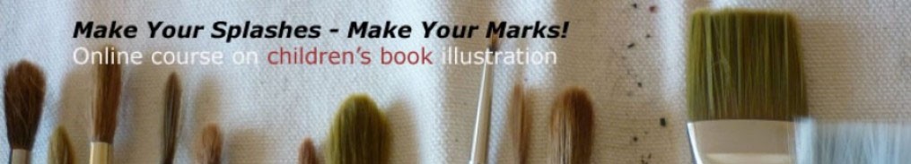
I’m writing educational content to stitch together the more than 100 videos I’ve made for my online course on illustrating children’s books, Make Your Marks and Splashes.
It feels like writing copy for a very large magazine article — or a big nonfiction book, requiring that same organization and the continual effort of trying to say more with less, which is the writer’s burden and bliss.
2.) How does my work differ from others of its genre?
I’d like to answer this from the perspective of someone who has written nonfiction books for children. In researching and reporting my subjects, I try to create a vivid sensory experience and a feeling of place to try to put the reader inside the situations I’m writing about.
I also like to have a a storyline — if I can find it in the material.

“Raising ‘La Belle’: the Story of the ‘La Salle Shipwreck'” written and illustrated by Mark Mitchell (Eakin Press)
3.) Why do I write what I do?
My reporting experienced has influenced how I write.
I try to follow the rules of journalism while also remembering that I want to incite the reader to keep reading, to go on to that second paragraph.
So I think that curiosity and suspense are ways to hold a reader (of any age) and also a way to set fire to a reader’s imagination, which helps the reader to identify with a story.
In a creative nonfiction story those suspense-creating elements must arise from a foundation of solid reporting.
As children’s nonfiction author Russell Friedman has said, “A nonfiction writer is a storyteller who has sworn an oath to tell the truth.”
4.) How does my writing process work?
First research and making notes, then interviews, followed by lots of personal observation of locales, if possible and making more notes. Then a few thumbnail outlines, trying to tease out the ‘plot points’ ‘dark moments’ and the climax, if I can find them in the material.
Next a rough draft, ‘the sloppy copy’ as they say in elementary school, typed in an inspired burst or a series of inspired bursts over many months.
Then editing, untangling all those knots of bad prose fishing line. Simplifying, smoothing out and lots of cutting, until the language feels alive and like it has found its voice for the story.
* * * * *
Next up on the tour, author-illustrator and watercolor fine artist Rob Smith who will post next Monday April 7 on his own writing process — writing in words and pictures. Rob is the author-illustrator of the Kindle e-book, Undead Ted as well as the author of the self-paced video course, Buildling EZ Picture Books for Kindle.
And author-illustrator Laurie Edwards whose first-in-a-series new YA book, Grace and the Guiltess (Curious Fox – UK) under her nom de plume Erin Johnson has just been published. Three other books in the WANTED series will be coming out in May, August, and December, Laurie says. Laurie’s in the middle of edits on her NA/adult nonfiction book, Cyber Self-Defense, written with cybercrime expert Alexis Moore, which is set to release in October from Globe Pequot.
Stay tuned for more details/authors on the Writing Process Blog Tour.


